
Time for a practical exercise in flexbox! In this tutorial we will use flexbox to create a mobile-first, responsive, toggleable navigation bar with different layouts for mobile, tablet, and desktop screens.
Note: This tutorial has been updated to include a responsive submenu and pure JavaScript instead of jQuery.
Flexbox is Perfect for Responsive Navigation
Flexbox is a versatile layout module with which we can create one-dimensional layouts that require flexibility, such as responsive menus. Using flexbox’s ordering, alignment, and sizing properties, we can build navigation bars that adapt their layouts to the viewport size while keeping the HTML outline logical and accessible.
In this tutorial, we’ll look into how to create a responsive navigation bar with flexbox. Our flexbox navigation will have three different layouts, depending on the viewport size:
- a mobile layout in which only the logo and a toggle button will be visible by default and users can open and close the menu using the toggle,
- a tablet layout in which we will show two call-to-action buttons between the logo and toggle in the default state and the rest of the menu will remain toggleable,
- a desktop layout in which all the menu items, except for the toggle button, will be visible on the screen.
We will use media queries to detect the viewport size of the user’s browser. Our responsive navigation bar will be mobile-first, so we will create the mobile layout first. Then, we will add the tablet- and desktop-specific CSS using min-width media queries.
The navigation bar will also have a JavaScript-based dropdown submenu that opens and closes when the user clicks the parent menu item.
Here’s how the menu will look on mobile:

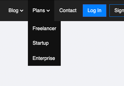
Here’s the tablet version:

And, this is how it will look on desktop:

You can also test, fork, and play around with the interactive demo on CodePen:
New to Flexbox?
If you aren’t used to flexbox, or need a refresher, these beginner guides will give you all the skills you need to complete this tutorial:
 FlexboxA Comprehensive Guide to Flexbox Alignment
 FlexboxA Comprehensive Guide to Flexbox Ordering & Reordering
 FlexboxA Comprehensive Guide to Flexbox Sizing
1. Create the HTML
The HTML is a simple <ul> list, as you can see below. The .menu class will be the flex container and the list items will be the flex items. Their order will adapt to the viewport size of the user’s device. For example, the Log In and Sign Up buttons will come first on mobile, but will be displayed at the end of the menu on desktop. We will achieve this effect by making use of flexbox’s ordering properties.
<nav>
    <ul class="menu">
        <li class="logo"><a href="#">Creative Mind Agency</a></li>
        <li class="item"><a href="#">Home</a></li>
        <li class="item"><a href="#">About</a></li>
        <li class="item has-submenu">
            <a tabindex="0">Services</a>
            <ul class="submenu">
                <li class="subitem"><a href="#">Design</a></li>
                <li class="subitem"><a href="#">Development</a></li>
                <li class="subitem"><a href="#">SEO</a></li>
                <li class="subitem"><a href="#">Copywriting</a></li>
            </ul>
        </li>
        <li class="item has-submenu">
            <a tabindex="0">Plans</a>
            <ul class="submenu">
                <li class="subitem"><a href="#">Freelancer</a></li>
                <li class="subitem"><a href="#">Startup</a></li>
                <li class="subitem"><a href="#">Enterprise</a></li>
            </ul>
        </li>
        <li class="item"><a href="#">Blog</a></li>
        <li class="item"><a href="#">Contact</a>
        </li>
        <li class="item button"><a href="#">Log In</a></li>
        <li class="item button secondary"><a href="#">Sign Up</a></li>
        <li class="toggle"><a href="#"><i class="fas fa-bars"></i></a></li>
    </ul>
</nav>
You have probably noticed that menu items with a submenu (“Services” and “Plans”) have an <a> tag without an href attribute. We do this because these “empty” parent menu items don’t lead to any other page–they just open and close the submenu. Using the anchor tag without href is permitted and prevents the page from jumping up on small screens when the user clicks the empty menu item to open or close the submenu.
We also add the tabindex="0" attribute to <a> elements without a href attribute. This is because empty <a> tags are omitted from the default tab order, so we need to put them back to the tabbing order with the tabindex attribute to keep the menu keyboard-accessible.
Note: the toggle button at the end of the list uses a Font Awesome icon. To make the demo work, you’ll need to add the Font Awesome library to the <head> section of the HTML document from CDN using the code below. (If you want to make the menu work offline, you’ll need to host Font Awesome locally.)
<link rel="stylesheet" href="https://cdnjs.cloudflare.com/ajax/libs/font-awesome/5.13.0/css/all.min.css">
2. Add Some Basic Styling
For basic styling, I’ve set some default values and colors, however you can use any of your own style rules as well:
/* Basic styling */
* {
    box-sizing: border-box;
    padding: 0;
    margin: 0;
}
body {
    font-family: sans-serif;
    font-size: 16px;
}
nav {
    background: #222;
    padding: 0 15px;
}
a {
    color: white;
    text-decoration: none;
}
.menu,
.submenu {
    list-style-type: none;
}
.logo {
    font-size: 20px;
    padding: 7.5px 10px 7.5px 0;
}
.item {
    padding: 10px;
}
.item.button {
    padding: 9px 5px;
}
.item:not(.button) a:hover,
.item a:hover::after {
    color: #ccc;
}
3. Start With the Mobile Navigation
As our navigation will be mobile-first, we start with the mobile layout. Most responsive flexbox menus use column-based layouts for mobile, as menu items can be quickly packed below each other by adding the flex-direction: column; rule to the flex container. Even though this is an excellent solution, we won’t use it in our example.
Instead, we will create a wrapping, row-based layout for mobile so that we can display the logo and toggle button next to each other on top of the menu.
The CSS trick here is that we make regular menu items such as Home and About span across the entire container using the width: 100%; rule. So, flexbox will display them below each other, while the logo and toggle will retain their natural sizes and sit on top of the navbar in the same row.
In the CSS below, we also use the justify-content and align-items properties to align the flex items horizontally and vertically. Besides this, we hide the .item elements using the display: none; rule. Menu items will be only revealed when the user clicks the toggle button. The .active class is not in the HTML code, we will dynamically add it with JavaScript.
/* Mobile menu */
.menu {
    display: flex;
    flex-wrap: wrap;
    justify-content: space-between;
    align-items: center;
}
.menu li a {
    display: block;
    padding: 15px 5px;
}
.menu li.subitem a {
    padding: 15px;
}
.toggle {
    order: 1;
    font-size: 20px;
}
.item.button {
    order: 2;
}
.item {
    order: 3;
    width: 100%;
    text-align: center;
    display: none;
}
.active .item {
    display: block;
}
.button.secondary { /* divider between buttons and menu links */
    border-bottom: 1px #444 solid;
}
As you can see above, we have also changed the order of menu items with the help of the order property. Our HTML outline follows a logical order. This is how we want screen reader users and search engine bots to go through the menu.
However, in the mobile layout, we want to show the logo and toggle button on top of the menu. We also want to display the two call-to-action buttons (“Log In” and “Sign Up”) before regular menu items. So, we set up the following order:
-
.logogets theorder: 0;value, as it will be the first item (however, as this is the default value oforder, we don’t need to add it to the CSS), -
.togglegets1, as it comes right after.logo, -
.item.buttonbelonging to the Log In and Sign Up buttons gets2, - and
.itembelonging to the rest of menu items gets3.
4. Style the Submenu
As this is mobile-first navigation, we’ll primarily style the submenu with mobile screens in mind. This is a great technique, as it’s usually harder to create a user-friendly submenu for small screens than for larger ones. Then, we can use the same submenu layout for tablet screens as well. For desktop, we’ll only need to change the positioning of the submenu.
By default, the submenu is set to display: none; and will be only revealed when the user clicks the parent menu item. We will add the required JavaScript functionality in the next two steps before moving on to the tablet menu.
/* Submenu up from mobile screens */
.submenu {
    display: none;
}
.submenu-active .submenu {
   display: block;
}
.has-submenu i {
    font-size: 12px;
}
.has-submenu > a::after {
    font-family: "Font Awesome 5 Free";
    font-size: 12px;
    line-height: 16px;
    font-weight: 900;
    content: "f078";
    color: white;
    padding-left: 5px;
}
.subitem a {
    padding: 10px 15px;
}
.submenu-active {
    background-color: #111;
    border-radius: 3px;
}
As you can see above, now we add the Font Awesome icons using CSS instead of HTML. These icons we add using the ::after pseudo element will be the little down arrows shown next to each menu item that has a submenu.
If you remember we added the Font Awesome icon for the toggle button with HTML in Step 1. This is because the toggle button will be targeted with JavaScript, so it has to be present in the DOM. However, the down arrows here are just style elements that indicate the presence of the submenu. Since no functionality relies on them, it’s better to add them with CSS.
5. Add the Toggle Functionality with JavaScript
We’ll set up the toggle functionality by adding a click event listener to the toggle button that opens and closes the menu on mobile. In the JavaScript code, we will use the ES6 syntax that gives us access to the const and let notation and the for...of loop and already has good browser support.
For the custom JavaScript, create an empty script.js file and add it to the HTML before the closing </body> tag:
<script src="script.js"></script>
And here’s the JavaSript code responsible for the toggle functionality:
const toggle = document.querySelector(".toggle");
const menu = document.querySelector(".menu");

/* Toggle mobile menu */
function toggleMenu() {
    if (menu.classList.contains("active")) {
        menu.classList.remove("active");

        // adds the menu (hamburger) icon
        toggle.querySelector("a").innerHTML = "<i class=’fas fa-bars’></i>";
    } else {
        menu.classList.add("active");

        // adds the close (x) icon
        toggle.querySelector("a").innerHTML = "<i class=’fas fa-times’></i>";
    }
}

/* Event Listener */
toggle.addEventListener("click", toggleMenu, false);
-
First, we select the menu and the toggle button using the
querySelector()method so that we can access them with JavaScript. - Then, we add the custom
toggleMenu()function that will be called when the toggle is clicked. - Lastly, we add the event listener that will be listening to the click event using the
addEventListener()method.
6. Add the Dropdown Functionality with JavaScript
Now, when the user clicks the toggle button, the menu is activated and deactivated, however, the submenu is still hidden. We will add this functionality with the following JavaScript:
const items = document.querySelectorAll(".item");

/* Activate Submenu */
function toggleItem() {
  if (this.classList.contains("submenu-active")) {
    this.classList.remove("submenu-active");
  } else if (menu.querySelector(".submenu-active")) {
    menu.querySelector(".submenu-active").classList.remove("submenu-active");
    this.classList.add("submenu-active");
  } else {
    this.classList.add("submenu-active");
  }
}

/* Event Listeners */
for (let item of items) {
    if (item.querySelector(".submenu")) {
      item.addEventListener("click", toggleItem, false);
      item.addEventListener("keypress", toggleItem, false);
    }
}
Here, we add the .submenu-active class to each menu item with a submenu when the user clicks it.
- First, we select all menu items with the
querySelectorAll()method that returns a node list (rather than a single element likequerySelector()). - In the custom
toggleItem()function, we add and remove.submenu-activeto/from the clicked element. Note that in theelse ifblock, we remove the class from every other menu items that were previously opened. This way, it won’t happen that two submenus are open at the same time, as they can cover each other on desktop. - Finally, we loop through the
itemsclassList using afor...ofloop. Within theifblock, we add two event listeners to menu items that have a submenu: one for theclickevent for regular users who access the menu by clicking or tapping, and one for thekeypressevent for keyboard users.
7. Create the Tablet Menu
We’ll create the tablet layout using a min-width media query. On tablet, four menu items will be visible by default: the logo, the two call-to-action buttons (“Log In” and “Sign Up”), and the toggle. To make everything pretty, our CSS will:
- change the
orderof the menu items to adapt the layout to tablet viewports, - realign the items (see the explanation below),
- make the Log In and Sign Up buttons look like real buttons (in the mobile layout, they look like links, as they are part of the toggleable dropdown list).
In code:
/* Tablet menu */
@media all and (min-width: 700px) {
    .menu {
        justify-content: center;
    }
    .logo {
        flex: 1;
    }
    .item.button {
        width: auto;
        order: 1;
        display: block;
    }
    .toggle {
        flex: 1;
        text-align: right;
        order: 2;
    }
    /* Button up from tablet screen */
    .menu li.button a {
        padding: 10px 15px;
        margin: 5px 0;
    }
    .button a {
        background: #0080ff;
        border: 1px royalblue solid;
    }
    .button.secondary {
        border: 0;
    }
    .button.secondary a {
        background: transparent;
        border: 1px #0080ff solid;
    }
    .button a:hover {
        text-decoration: none;
    }
    .button:not(.secondary) a:hover {
        background: royalblue;
        border-color: darkblue;
    }
}
In the tablet layout, menu items are aligned in a different way. If you take a look at the four visible menu items, you will see that the two buttons are displayed in the center, while the logo and toggle are pushed to the left and right end of the container:
We can achieve this effect using the flex: 1; CSS rule. The flex property is a shorthand for flex-grow, flex-shrink, and flex-basis. It can exist with many different value combinations. When it’s declared with only one value, it belongs to flex-grow, with flex-shrink and flex-basis keeping their default values.
In the CSS above, we have added the flex: 1; rule to the .logo and .toggle elements. In this way, we can tell the browser that if there’s any positive space on the screen, we want to share it between these two elements. As the Log In and Sign Up buttons retain their default 0 value for flex-grow, they won’t get anything from the extra space. So, they will stay in the center of the container, as they adhere to the justify-content: center; rule set on the flex container.
8. Create the Desktop Menu
The desktop menu hides the toggle, sets back the original order and natural width of each item, and repositions the submenu.
It’s important to keep in mind that the tablet-specific rules also apply to the desktop menu. This is because here, the viewport width is larger than both 700px and 960px, so both media queries take effect. So, .logo retains its flex: 1; property and pushes the rest of the items to the end of the container.
/* Desktop menu */
@media all and (min-width: 960px) {
    .menu {
        align-items: flex-start;
        flex-wrap: nowrap;
        background: none;
    }
    .logo {
        order: 0;
    }
    .item {
        order: 1;
        position: relative;
        display: block;
        width: auto;
    }
    .button {
        order: 2;
    }
    .submenu-active .submenu {
        display: block;
        position: absolute;
        left: 0;
        top: 68px;
        background: #111;
    }
    .toggle {
        display: none;
    }
    .submenu-active {
        border-radius: 0;
    }
}
9. Let Users Close the Submenu By Clicking Anywhere on the Page
Now there’s only one step back. As the dropdown menu is activated on the click event, it doesn’t close automatically when the user hovers away from the top menu item. This is especially annoying on desktop where the dropdown can cover the content.
So, it would be nice to enable users to close the submenu by clicking anywhere on the screen. We can add the feature with JavaScript:
/* Close Submenu From Anywhere */
function closeSubmenu(e) {
  let isClickInside = menu.contains(e.target);

  if (!isClickInside && menu.querySelector(".submenu-active")) {
    menu.querySelector(".submenu-active").classList.remove("submenu-active");
  }
}

/* Event listener */
document.addEventListener("click", closeSubmenu, false);
The custom closeSubmenu() function checks if the user clicked inside the menu with the help of the target property. If not and there’s an active submenu on the screen, the .submenu-active class will be removed, so the submenu closes itself. We add the event listener to the document object, as we want to listen for clicks on the whole page.
You’ve Built a Responsive Navigation Bar With Flexbox and JavaScript!
Our mobile-first, responsive navigation bar is up and running in three different layouts.
Here’s a reminder of the end result:
Flexbox is a great tool to implement complex layouts without any tweaks. If you combine flexbox’s alignment, ordering, and sizing properties with media queries, you can create different layouts for different viewports without having to manipulate the HTML source code.
For a list of best practices you should consider when building responsive navigation, check out this guide:
-
6 Best Practices for Building Responsive Dropdown Menus
And if you are interested in how you can use flexbox in your everyday work, have a look at these other practical tutorials–each one helps you learn by building things you can actually use:
 FlexboxHow to Build a Responsive, Multi-Level, Sticky Footer With Flexbox
 CSSHow to Build a News Website Layout with Flexbox
 FlexboxHow to Build a Striped Navigation With Flexbox
 FlexboxHow to Build a Full-Screen Responsive Page With Flexbox
 CSS Grid LayoutSolving Problems With CSS Grid and Flexbox: The Card UI
Go to Source
Author: Anna Monus